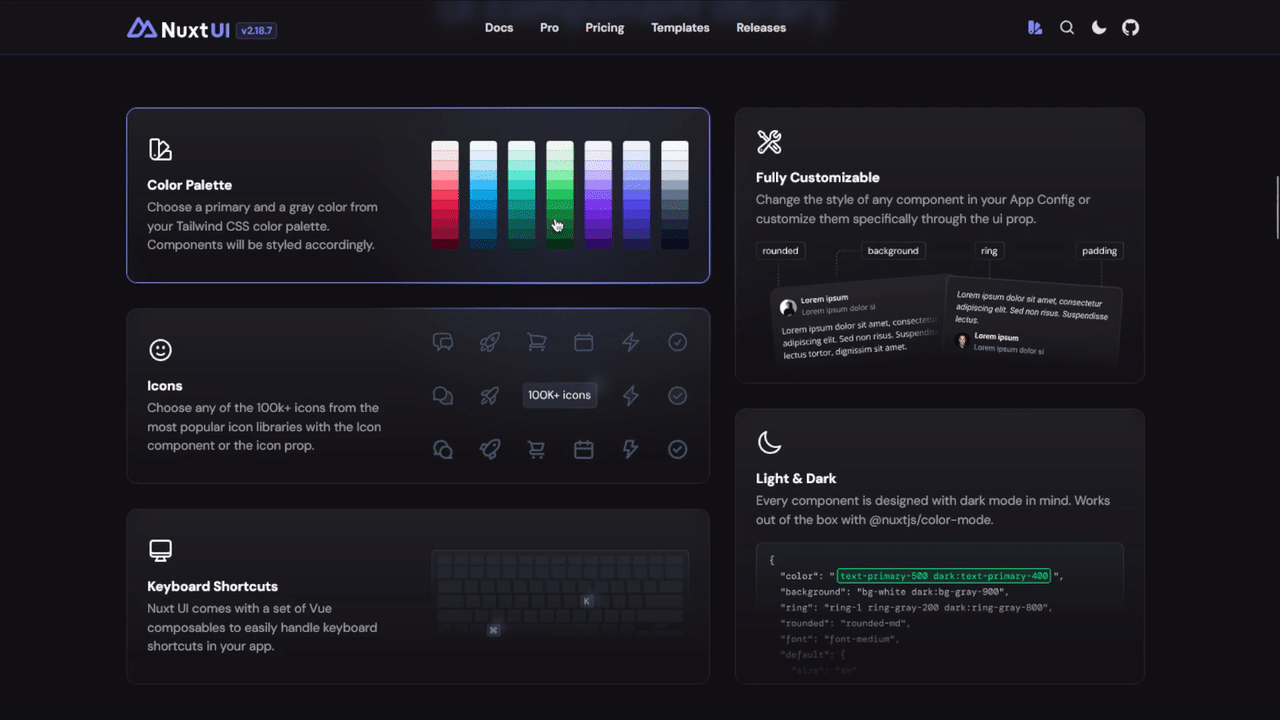
I came across an amazing card hover effect on the Nuxt UI website.
Unfortunately, it’s a pro component—so I decided to build it myself!
I tried getting some inspiration by inspecting their code, but it was more complex than I expected.
I’m no CSS wizard, so I came up with a much simpler version of this effect.
Here’s a tutorial on how to make a card with a cool gradient hover effect using TailwindCSS.
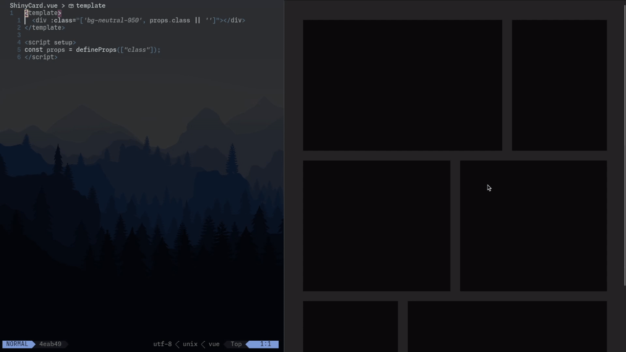
1. Set up a simple card component
<template>  <div :class="['bg-neutral-950', props.class || '']"></div></template>
<script setup>const props = defineProps(["class"]);</script>
Let’s start by building a basic card component with a black background, arranged in a grid.
This setup will be our testing ground.
I’m using Vue here, but this can be easily replicated with React, Vanilla JS, or any other framework.
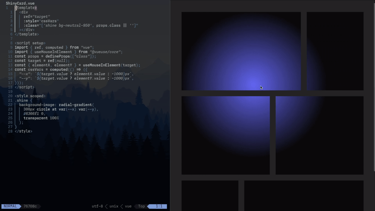
2. Add a circular gradient that follows the mouse
<template>  <div    ref="target"    :style="cssVars"    :class="['shine bg-neutral-950', props.class || '']"  ></div></template>
<script setup>import { ref, computed } from "vue";import { useMouseInElement } from "@vueuse/core";const props = defineProps(["class"]);const target = ref(null);const { elementX, elementY } = useMouseInElement(target);const cssVars = computed(() => ({  "--x": `${target.value ? elementX.value : -1000}px`,  "--y": `${target.value ? elementY.value : -1000}px`,}));</script>
<style scoped>.shine {  background-image: radial-gradient(    300px circle at var(--x) var(--y),    #6366f1 0,    transparent 100%  );}</style>
The next step is adding a circular gradient that follows the mouse.
- First, add a
shineclass to the carddivand set it up with aradial-gradient. - This gradient is centered at CSS variables
--xand--y, going from bright (any color) at the center to fully transparent, with a 300px radius (adjustable).
To make the gradient follow the mouse, I’m using a useMouseElement composable. Here, elementX and elementY are the mouse coordinates relative to the position of the target element.
Depending on your framework, you could use a different hook or add a mousemove event listener to update these CSS variables.
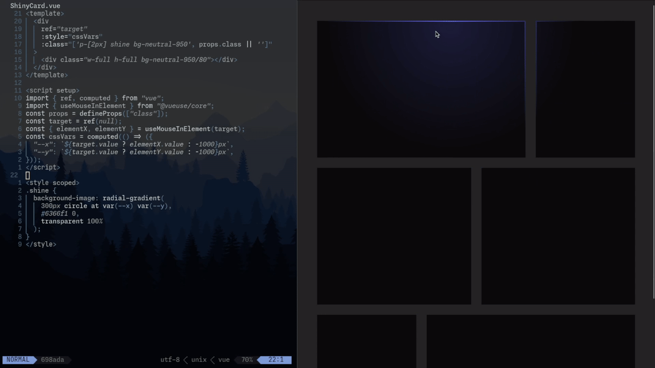
3. Stacking divs
<template>  <div    ref="target"    :style="cssVars"    :class="['p-[2px] shine bg-neutral-950', props.class || '']"  >    <div class="w-full h-full bg-neutral-950/80"></div>  </div></template>
<script setup>import { ref, computed } from "vue";import { useMouseInElement } from "@vueuse/core";const props = defineProps(["class"]);const target = ref(null);const { elementX, elementY } = useMouseInElement(target);const cssVars = computed(() => ({  "--x": `${target.value ? elementX.value : -1000}px`,  "--y": `${target.value ? elementY.value : -1000}px`,}));</script>
<style scoped>.shine {  background-image: radial-gradient(    300px circle at var(--x) var(--y),    #6366f1 0,    transparent 100%  );}</style>
I know what you’re thinking—it doesn’t look like the final card effect at all.
The trick to achieving the right look is to stack another div on top with a small amount of padding (I used 2px).
There are other ways to achieve this effect, like using ::before pseudo-elements or Tailwind rings, but I found this to be the simplest and cleanest approach.
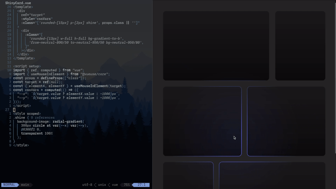
4. Finishing touches
<template>  <div    ref="target"    :style="cssVars"    :class="['rounded-[15px] p-[2px] shine', props.class || '']"  >    <div      class="rounded-[13px] w-full h-full bg-gradient-to-b from-neutral-800/50 to-neutral-950/50 bg-neutral-950/80"    ></div>  </div></template>
<script setup>import { ref, computed } from "vue";import { useMouseInElement } from "@vueuse/core";const props = defineProps(["class"]);const target = ref(null);const { elementX, elementY } = useMouseInElement(target);const cssVars = computed(() => ({  "--x": `${target.value ? elementX.value : -1000}px`,  "--y": `${target.value ? elementY.value : -1000}px`,}));</script>
<style scoped>.shine {  background-image: radial-gradient(    300px circle at var(--x) var(--y),    #6366f1 0,    transparent 100%  );}</style>
Finally, give the outer div a subtle background gradient and rounded borders.
To keep the padding and border-radius looking clean, I added 2px to the border radius of the outer div (general tip: adjust by padding * 1.141 for a proportional look).
Here’s the GitHub repo to see the code in action: